Puff embroidery is one of those things that looks simple until you see it done right. Then it’s like, oh… yeah, that’s the one. The raised stitching gives logos real presence, especially on hats and heavyweight gear.
It’s not a magic upgrade for every design though. Puff has rules. Break them and you’ll get a puffy mess. Follow them and you’ll get that bold, premium look people notice from across the room.
Working with a premium patch creator will really assist you in deciding when puff is a good idea and when it’s not. That one bit of honesty saves reorders.
Time to break down!
What Puff Embroidery Really Is?
Puff embroidery is basically 3D embroidery. Foam goes under the stitches, the machine stitches over it, and the result is raised lettering or shapes.
If you want the full breakdown from scratch, our guide on 3D embroidered patches includes how it’s made and which designs work. Use this guide once, then come back here for the use cases.
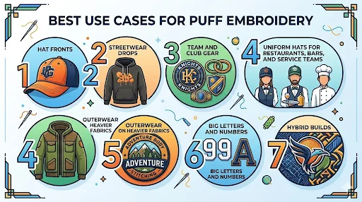
The Best Puff Embroidery Use Cases That Actually Pay Off
1) Hat fronts that need instant “brand presence”
This is a classic. Puff embroidery on a structured cap is a cheat code.
Why it works
- Hats have structure, so the raised stitching holds its shape
- The logo sits front and center, so height adds impact
- Simple lettering reads from a distance
Best hat types for puff
- Snapbacks
- Trucker hats
- Fitted caps
- Structured dad hats with a firmer front panel
Skip puff if
- Your logo is super detailed
- You need tiny text under the main mark
- The hat front is soft and collapses easily
If you really want puff on a detailed logo, go hybrid. Puff the big letters. Keep small text flat.
2) Streetwear drops where texture is part of the product
Streetwear buyers don’t just look at the logo. They look at how it’s built. 3D embroidery patches with puff have that “made on purpose” feel.
Where it wins
- Short brand names
- Big initials
- Simple icons
- Bold number patches on hoodies and jackets
Where it fails
- Designs that need sharp micro detail
- Multi-line slogans in tiny text
A good streetwear puff logo has breathing room. If you’re trying to fit a full sentence, puff is not the tool.
3) Team and club gear with bold lettering
This is where puff feels natural. Teams already lean bold. Puff makes it look more legit.
Strong fits
- Baseball and softball hats
- Booster club caps
- Hockey team hoodies
- Crew or club jackets
Design tips that keep it clean
- Block fonts beat thin fonts
- One strong element beats five small elements
- Keep outlines and small details flat
If you’re choosing between puff and flat embroidery for a team logo, the difference is basically this: puff is for the “main statement.” Flat is for the details.
4) Uniform hats for restaurants, bars, and service teams
A lot of uniform programs want something that looks premium without being loud. Puff embroidery can do that if the logo is simple.
Best for
- Coffee shops
- Breweries
- Food trucks
- Retail teams
- Barbershops and salons
Why it works
- A raised logo on a cap looks high-end fast
- It reads clean even when the hat gets worn daily
Watch out
- If staff hats get heavy washing and rough handling, puff edges can wear faster than flat embroidery
- If you need a small text like “EST. 1998” under the logo, keep that part flat
5) Outerwear patches on heavier fabrics
Puff works best when the fabric can support it. Outerwear is perfect for that.
Great placements
- Jacket chest patches
- Hoodie front logos
- Sleeve badges if the design is bold
Not ideal
- Thin performance shirts
- Lightweight tees
- Tight placements where raised stitching will crease
If your patch is going on outerwear, puff can look insanely good. Just don’t pretend a detailed crest will stay sharp when puffed.
6) Big letters and numbers that need to stand out
If your design is basically letters and numbers, puff is in its element.
Examples
- “STAFF” patches
- “SECURITY” on caps
- Initials for a brand
- Jersey-style numbers
This is where puff looks clean even at smaller sizes because the shapes are simple.
7) Hybrid builds for logos that need both pop and detail
This is the most underrated use case, and it’s where most brands should land.
What hybrid means
- Puff for the main wordmark or icon
- Flat embroidery for outlines, small text, or fine details
Hybrid solves the two biggest puff problems:
- Small text gets messy
- Fine details disappear
Want a quick way to decide if you need a hybrid? If your logo has more than one “reading layer” (main mark plus smaller text), go hybrid.
If you want a direct comparison before you decide, have a gaze on our: 3D Embroidery vs Regular Embroidery guide.
Use Cases Where Puff Embroidery Is Usually a Bad Call
These are the situations that cause the “why does it look weird” moment.
Tiny text heavy logos
Puff will blur it. You can’t fight physics.
Super detailed emblems and crests
If the design has lots of inner shapes, puff turns it into a bumpy blob unless you go hybrid.
Lightweight garments
Puff needs support. Thin fabric makes it look bulky and uneven.
Extreme abrasion or rough use gear
Puff can still work, but if the patch is constantly scraping against surfaces, consider other materials. The broader patch type guide helps you choose based on performance and attachment, not vibes: Custom Patches Breakdown: Types, Backings, Borders & More.
How to Choose the Best Puff Embroidery Build for Your Project
Keep it simple. Answer these:
- Is the placement structured or heavy fabric
- Is the logo bold enough for raised stitching
- Do you need small text that must stay readable
- Is this for everyday wear or occasional wear
- Do you want full puff or hybrid puff plus flat
If you can answer those, you can order puff embroidery without guessing.
Frequently Asked Questions
Make Puff Look Intentional!
Puff embroidery looks premium when it’s used where it makes sense: structured hats, bold logos, heavy garments, and hybrid builds that keep the details readable. If you want a clean, raised look, don’t force puff onto a logo that’s begging for fine detail.
Want to move fast without guessing? Share your logo, where it’s going, and the quantity. The Prime Emblem expert team can tell you straight if the puff will look sharp or not while setting up a proof that matches the real end product.